
In the winter of 2025, I led the redesign of the Boston 311 logo.
I worked closely with the Director of Boston 311 and the City’s Creative Team to ensure the new logo met accessibility standards, accurately represented the 311 service, and aligned with the future direction of the City of Boston brand.
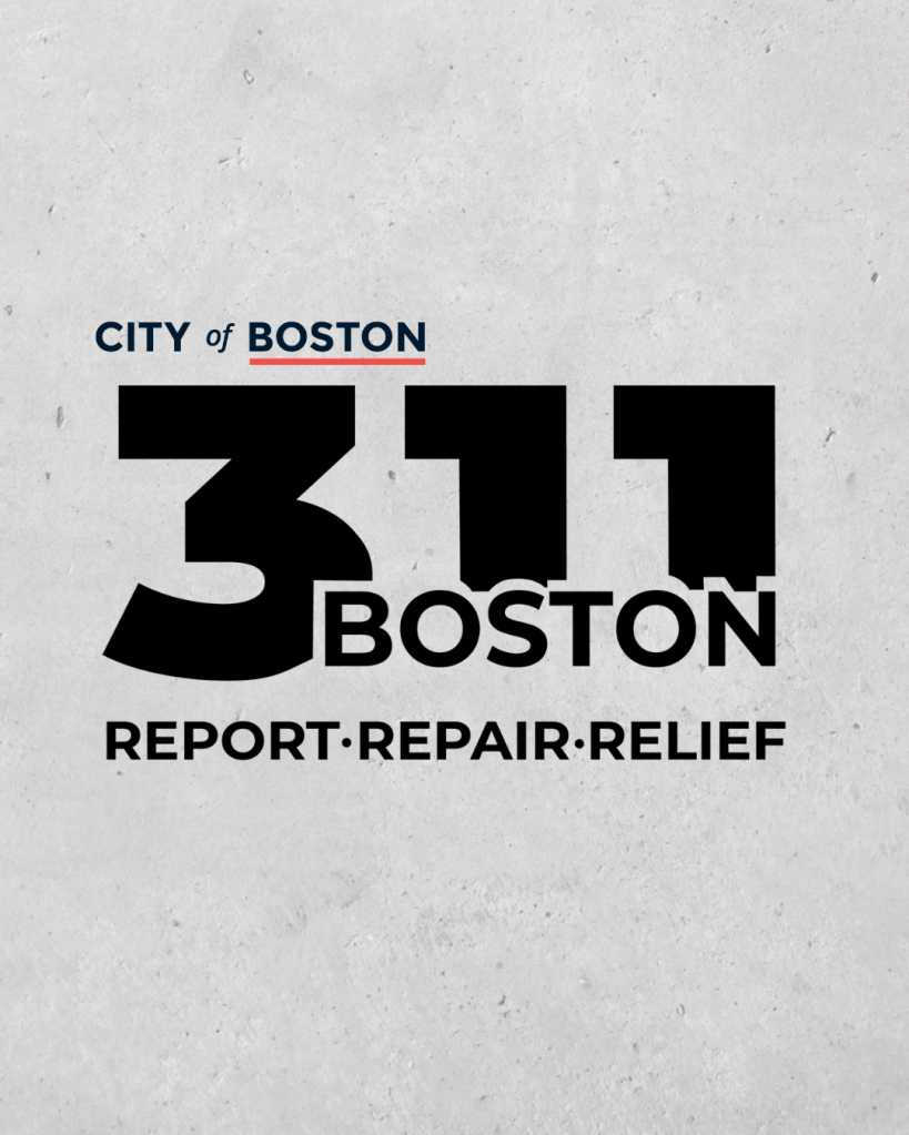
The logo is rooted in the City’s traditional Montserrat typeface. I integrated “Boston” directly within “311,” visually reinforcing 311 as a foundational pillar of the City and emphasizing its role as an integral part of Boston’s civic infrastructure. The form of “311” and its internal cutouts evoke elements of the Boston skyline, positioning 311 as just as essential and iconic as the buildings that define the city itself.
We also introduced a tagline, “Report, repair, relief.” The phrase reflects the core structure of the 311 process: residents report an issue, 311 routes it to the appropriate City department, and solutions follow. At the same time, the tagline captures the reassurance residents feel knowing that 311 is there to help.
Overall, the redesign highlights the interconnectivity between Boston 311 and the City of Boston, presenting 311 as both a practical service and a trusted civic partner.
