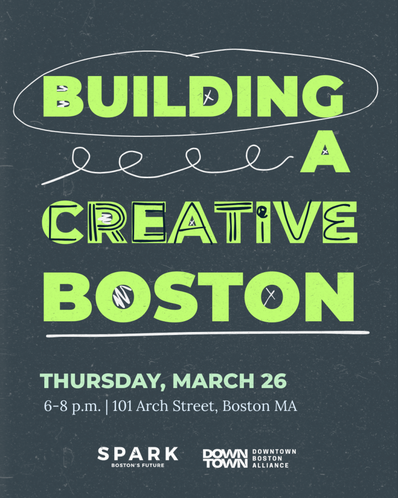
In the Spring of 2026, I worked with SPARK Boston to create their event flyer for their Building a Creative Boston panel discussion in collaboration with the Downtown Boston Alliance.
When approaching this project, I wanted to lean into the creative heart and topic of the event. I had been taking a Typography course in pursuit of my graduate degree and thus had been researching typographic designs extensively. Due to this, I felt that this graphic design project would be a great time to let the typography be the center of the design. I had come across mixed typography designs and loved the edgy, messy nature of it and felt it had the right tone for this panel discussion.
From there, I mixed the City’s branded Montserrat Black font and hand drawn elements. I wanted creative to be the focus and decided to add that emphasis by allowing it to be the only doing hand drawn characters over that singular word. In order to bring the messy, hand drawn elements into the rest of the design to provide a sense of unity, I added scribbles and xs into the negative space of letters such as o, b, r, and a. To then bring the white elements into the overall design, I added hand drawn circles, squiggles, and lines.
Once I was done creating the hand drawn elements, I chose my colors. From the City’s brand, I chose a muted grey blue as the background and a vibrant green as my main text color. I used this combination of colors so that the text was even further emphasized as the focus of the design. It demands your attention upon initially looking at it. To add the date and time, I decided to bring a muted green from our color palette in as an accent to the vibrant green but not as attention pulling. I wanted my viewers to focus on the title of the event first and foremost, and then work their way down to the date, time, and location.
When I had all my content blocked, colors chosen, and hand drawn elements finalized, I brought in a texture over the background and text. I layered the same texture over the design—first, I layered the texture in a muted white and laid it over only the background; then I brought that same texture back over the full design but in a muted grey. This adds more dimension to the overall design and makes it feel more lived in, however, this also brings more dimension and depth to the text—it helps to tone the green down just a bit while still allowing it to shine.
Overall, this design project was very successful and a fun way to incorporate my continuing education into my work!
