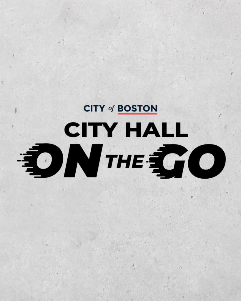
In 2025, my team and I began a redesign of the City Hall on the Go Truck, a beloved community resource that brings City services beyond the walls of City Hall and directly into Boston’s neighborhoods. As we approached the redesign, I advocated for creating a dedicated logo for the program. One that could live not only on the truck itself, but also across future marketing and outreach materials. With approval from the Director of Civic Organizing and the City’s Creative Team, I designed the City Hall on the Go Truck logo.
From the beginning, I knew the logo needed to convey movement. City Hall on the Go is, quite literally, mobile: a truck that travels throughout the city, meeting residents where they are. To ground the design in familiarity, I rooted it in the City’s branded typeface, Montserrat, preserving the recognizable City of Boston look and feel.
With that foundation in place, I introduced motion. I set “On the Go” in italics to suggest forward momentum and added motion lines to the “O” in “On” and the “G” in “Go,” creating the sense that “City Hall” itself is moving, rolling forward on wheels. In contrast, “City Hall” remains in unaltered Montserrat, symbolizing the strength and stability of the City Hall building.
Overall, the logo reinforces the mission, impact, and reach of the City Hall on the Go initiative, visually expressing how City services extend beyond a single building and into the communities they serve.
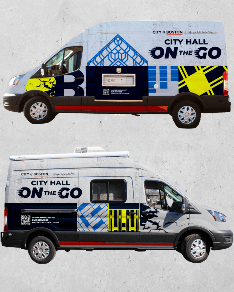
City Hall on the Go Truck Wrapping
To complete the City Hall on the Go Truck project, we shifted our focus to the design of the truck itself.
Working closely with the City’s Creative Team and the Office of Civic Organizing during the ideation and creation phases, I served as the lead designer for the truck. From the beginning, I knew I wanted the new design to function as an ode to City Hall. True to the program’s name, City Hall on the Go, the goal was to make it feel as though we were transporting not just City services, but the building, and its essence , directly into Boston’s neighborhoods.
Through our ideation process, we landed on creating mosaics inspired by architecturally compelling elements of City Hall. These elements were abstracted into patterned forms, allowing the building’s details to be reinterpreted in a contemporary, approachable way. To further reference City Hall, we incorporated the building’s iconic cast-in-place concrete as the primary texture of the truck.
The color palette is rooted in the City’s Charles Blue, Optimistic Blue, and a supporting gray, reinforcing the City of Boston brand. A pop of yellow was introduced to represent forward momentum—the future of the City and the impact of City services.
Overall, the design is an ode to what has been dubbed the second ugliest building in the U.S., inviting residents to see City Hall in a new light and discover the beauty embedded in its smallest details.